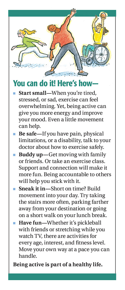
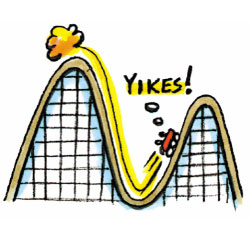
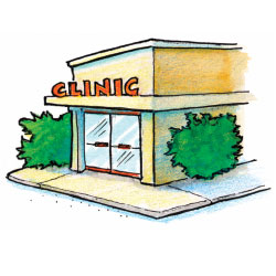
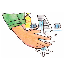
Anatomy of a pamphletA quick guide to what makes an effective, accurate and easy-to-read pamphlet.

Diversity
Readability
Layout
Illustrations
Credible Sources
Professional and Peer Review
Journeyworks Publishing is a trusted leader in the development of accurate, easy-to-read materials that people want to read. We have distributed over 200 million titles to health and social service agencies in all 50 states and U.S. Territories. |
- ABOUT US
- Our Company
- Staff
- Products
- Contact Us
- CUSTOMER SERVICE
- Customer Service
- Guarantee & Return Policy
- How to Place an Order
- Download Order Form
- Imprint & Customize
- Shipping Information
- How to Request a Price Quote
- How to Request Review Samples
- How to Request a Catalog
- Free Supplemental Resources
- CONTACT US
- Phone
- U.S. & Canada 1-800-775-1998
- International 1-831-423-1400
- Fax
- U.S. & Canada 1-800-775-5853
- International 1-831-423-8102
- service@journeyworks.com
- Journeyworks Publishing
- PO Box 8466, Santa Cruz, CA 95061
- Location
- Journeyworks Publishing
- 763 Chestnut St., Santa Cruz, CA 95060
© Copyright 1995 - Journeyworks Publishing | Privacy Policy


